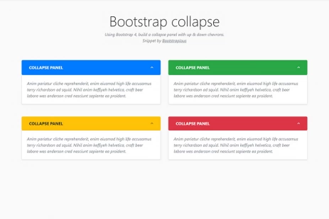
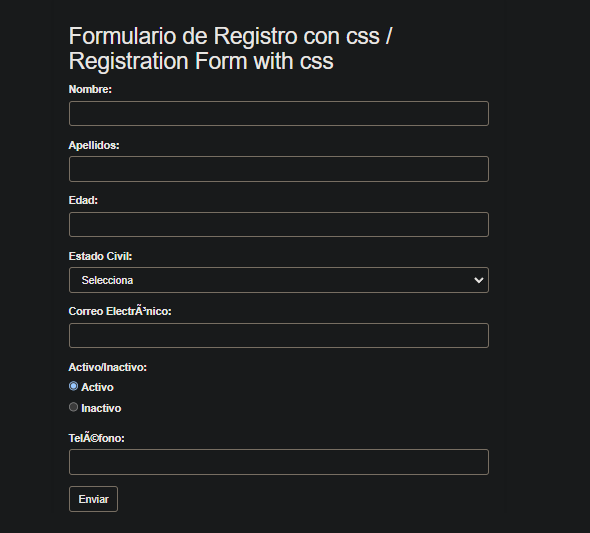
flexible grid layout with css flexbox
Explore the ease of creating responsive grid layouts using CSS Flexbox. Learn to effortlessly structure and align elements for optimal responsiveness across devices. Elevate your CSS skills with this beginner-friendly guide to building dynamic and adaptable grids.
 Views: 1258
 2017
2017